I recently joined Clubhouse — thanks to Lee Vann and to Kathrin Bussmann for inviting me to participate in one of her weekly chats.
When I “onboarded” to the app I was struck by something I did not expect to see in this “born global” Silicon Valley creation.
Flags.
Or, more specifically, flags used to indicate language.
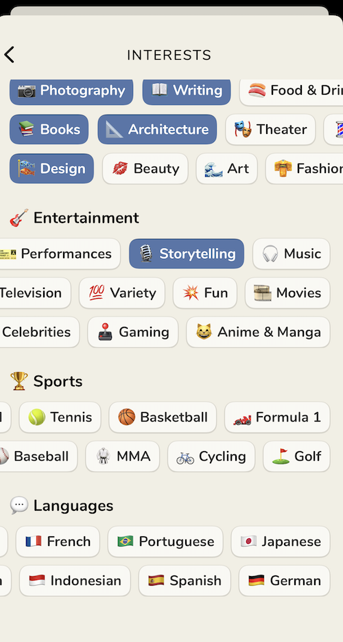
When you create your account you are asked to select your interests, seen here:

I suppose that once Clubhouse committed to using icons in each button that it felt somewhat inevitable to use flags to indicate languages. But flags narrow the reach of each language. Should I click Spanish if I’m interested in Latin American Spanish or should I only click if I’m interested in Spain? Languages are not confined to national borders, which is the visual and geopolitical dilemma presented here.
It’s reasonable to assume that anyone who sees the flags understands the overall intent of the icons. Nevertheless, I would still suggest removing them.
In fact, I’m not sure icons are needed on this page at all. If you removed icons you’d free up some valuable real estate, and allow yourself to get more expansive with interest tags. Personally, I would have loved to see a “language generalist” button.
Once I clicked through this screen I did find the app easy to use and mildly addictive. It is a shame that the chats aren’t recorded for playback, though I understand that this one of the selling points. I suspect this will change in the future.
