Apple has been using flags as part of its global gateway for many years.
In 2006, Apple’s global gateway was positioned in the footer and featured a different flag for each country web site:

Today, Apple has done away with the pull-down menu, but not the globe. Look to the right of the footer of Apple.com and you’ll see this:

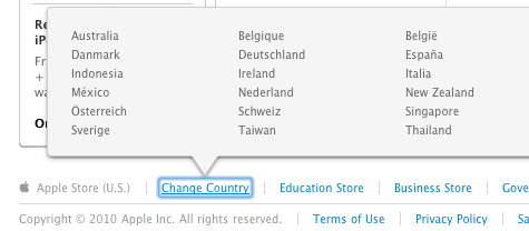
But Apple recently moved away from using flags on its online store, perhaps a sign of things to come, shown below:

The flags have been replaced with plain text links.
I’m not saying that Apple is wrong for using flags. Apple does not make the mistake of using flags to indicate language. Flags are only used to indicate countries and regions.
But flags do not scale well.
Flags worked better when Apple supported fewer than 20 localized site. But Apple is clearly in scale mode, adding stores in countries around the world. Plain text links add less overhead (in bytes) than images and, more important, are easier for people to scan than a blur of flags that mostly share the same basic colors.
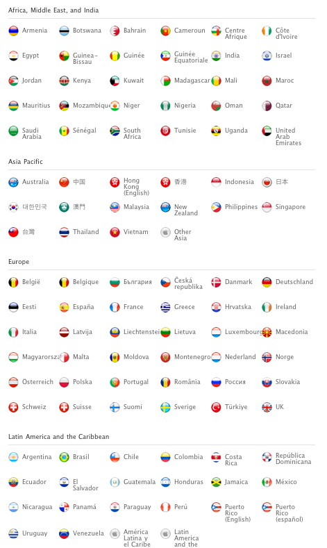
Consider the page below, also from Apple. I don’t believe this sea of colors amounts to any sort of usability gain. In fact, if you look closely you’ll see some faux flags created for “Other Asia” and “Latin America.”

I don’t hate flags. Really, I don’t.
But as I write in The Art of the Global Gateway, flags have many inherent limitations — from geopolitical to practical. And because flags do not scale well I think that Apple will eventually (largely) give them up.
