I bought a LaCie hard drive recently, and I noticed an interesting gap between the global usability of the LaCie Web site and the installation software that shipped with the drive.
I’m sure this is an issue not unique to LaCie. The folks who manage the Web site generally sit in a different part of the company from the folks who develop the installation software. So the end result is two different user experiences — and inconsistent experiences at that.
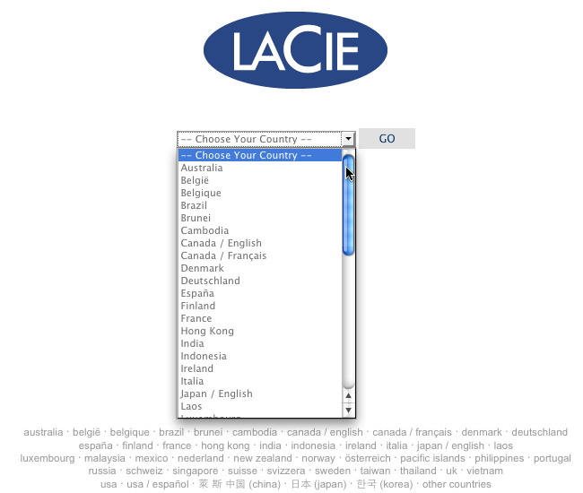
First-time visitors to LaCie.com will encounter this splash global gateway:

I’m not a huge fan of the pull-down menu, but there are also text links positioned underneath the menu for those who’d rather not bother scrolling. Overall, it’s a nice way to welcome people to your Web site — by ensuring that they’ve found their localized content as early as possible in the process.
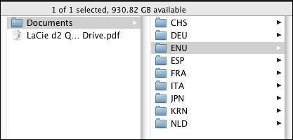
After purchasing my hard drive, I inserted the CD that shipped with it and this is the first screen I saw;

“ENU” was the folder I needed to open.
But I had to think about it. “English_US” would have been clearer. And what about the other options? Is CHS for Switzerland? Is NLD for the Netherlands? I would assume so, but I can’t imagine that I’m alone in having to think about this. And you really shouldn’t make your customers think about these details.
A simple splash screen — based on the Web design — would have been a much more user-friendly way to present these options.
I want to emphasize that this is a disconnect not unique to LaCie. It has to do with different groups within same company all tackling the same general problem — with different results.
My prediction is that the people who manage global Web sites are going to see their scope widen in the years ahead as they assist other customer-facing parts of the company develop consistent global interfaces. It’s all about consistency these days — easier said than done — but those who do it well truly stand apart.
