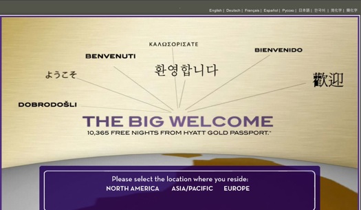
It’s been awhile since I’ve written about global gateways — those landing pages and header elements that companies use to direct visitors to localized web sites.
I came across one that I’ve been meaning to write about for some time — it’s the home page of a promotion Hyatt Hotels ran several months ago.

The site is still live here.
It’s a visually engaging global gateway and I love the many translations of “welcome” in the center of the page. Unfortunately, this gateway demonstrates three practices companies should avoid repeating. I’ll call them rules.
Rule #1: Global gateways should place function above beauty
I’ve got nothing against a great-looking web page. But job number one is getting users to where they want to go, and quickly. In the case of Hyatt, all those “welcome” languages are engaging, but they’re not clickable, something I learned when I tried clicking on “Bienvenido” and then “Benvenuti.” They’re just design elements.
The only clickable links on the entire page are at the very top and the very bottom of the page, which leads me to the next rule.
Rule #2: To paraphrase Steve Krug, don’t make users think about what language or country they need to select
The global gateway should require no thought whatsoever. But let’s say I speak German and I land on this page. I could click the “Europe” link at the bottom of the page or I could click the “Deutsch” link at the top of the page. Which do I choose? The very fact that I have to think about it means the design is flawed.
What’s interesting here is that if you select “Europe” a list of available languages will appear below it. Why not just have those languages there all along? Perhaps that would have helped. I think so. But the fact that there are two selections that the user must decide between is inherently bad design.
Rule #3: Don’t pretend you speak languages that you don’t
What’s really unfortunate about Hyatt’s gateway is that some of the “welcome” languages are not supported by localized web pages — such Greek and Slovenian. This could give visitors the impression you support their language when you really don’t. Not a great idea. Managing user expectations is critical, particularly when it comes to localized content.
Fortunately, the Hyatt gateway was temporary.
What do you think? Was I being too hard on the site? And are there any rules you would add?

I don’t think you are too hard on this site at all.
In my experience, you need to be aware of two things:Not everyone knows which region their country is in.Not everyone knows what their country is called in English.Not everyone can point out their country on a map..
So I think the best option for a portal page is still to show all available countries in their own language. It generally doesn’t make for the most elegant page, but it does get users where they need to go.
I’d have a ruke to add: Make it visible to the user how she can change the language.
Their homepage http://www.hyatt.com/hyatt/index.jsp is language negotiated, thumbs up. But what if the the browser settings are wrong and the user does not speak the displayed language? How does the user know she would have to click on “English” if she doesn’t understand English at all? Pull-down menus for language setting are problematic, cf. http://www.w3.org/International/questions/qa-navigation-select
Not sure how important this is, but when you click on North America as the region of residence it automatically takes you to the English version of the site. If you click on Europe there is the option to view the site in Spanish. Clearly the site is tailored to Spanish from Spain, but what about US-based Spanish speakers (and others) who might prefer to see content in Spanish but would never click Europe as region of residence? How will they ever know their prefered language is available? I’m sure the majority won’t be clicking on Europe to find Spanish. Also, If you click on Español at the top of the page, there is then the option to click on the region of norteamerica, but the content is then delivered in English. Granted there is an inherent problem because the content is region-specific. If you live in Europe the winner you read about is from London. If you click on Europe and then Spanish, you see the European content (London winner) in Spanish. Still, I’d rather read and understand the text about the London winner than have to read about the North American winner in English when I was specifically looking to view the site in my native language.
Hi Erin — great point!
When sites make assumptions about geography and languages, gaps are inherently created — gaps that users can fall in between.
I agree with Erin. It’s always complicated – for example I live in Norway but I don’t necessarily want to see a Norwegian version of the website I visit (flysas.com) or service I want to use (e.g. iTunes). Just because I live in a particular country doesn’t mean I want to view a site in the main language of that country. But then again, I do want to see products or services available only here. So I often check ikea.no to see what I could buy and at what price but might have to visit ikea.co.uk to see English-language descriptions. Of course, many international users are used to finding such shortcuts around these problems.
Are there examples of sites that really get it right? there are so many variables.