I know it appears that I’m out to punish Mailchimp — as I first started calling out its rookie mistakes back in 2021. I am a paid subscriber so I feel as if I’ve at least earned the right.
What I’m calling out here is a common rookie mistake and, hopefully, a learning moment for other emerging global companies.
Let’s start with the global gateway just to set the stage. Shown below, Mailchimp does a good job of including the global gateway menu in the header (though the icon could use improving).
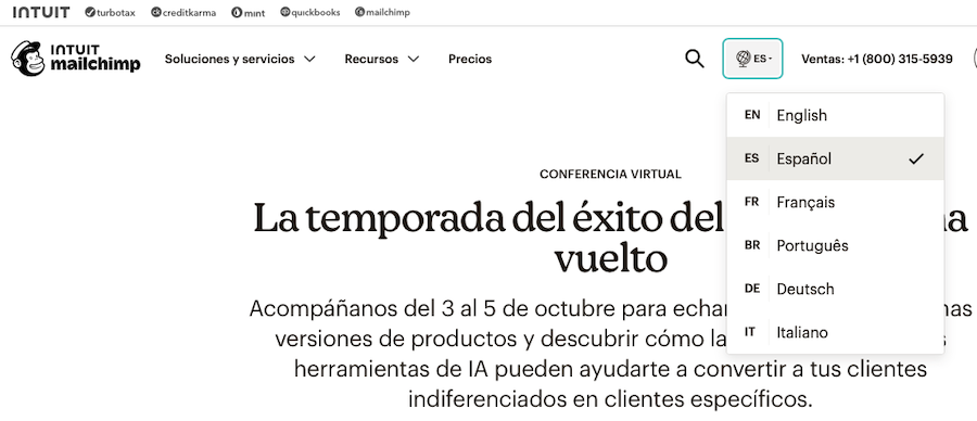
Now, let’s assume you’re a visitor who speaks Spanish. You change language and the home page looks well localized.
Until you scroll down slightly and see this…
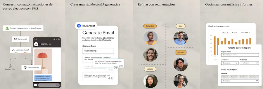
Look above again and see if you can spot it.
The product images are all in English. Why?
Blame it on a rookie mistake.
To be sure this was a mistake I changed the language to German and saw this:
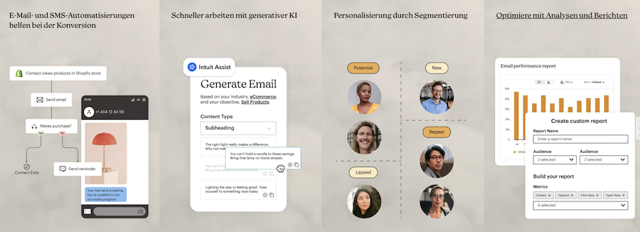
Normally, companies that include sample screens in languages that don’t align with the page do so because they have yet to actually localize the product. But this isn’t the case with Mailchimp. It has localized its software into these six languages, but not as well as it could have.
UPDATE: I wrote the words above a few months ago (and forgot about them, as I sometimes do).
So I revisited Mailchimp and was happy to see improvement on the Spanish site:

But Mailchimp has not fully escaped its “rookie mistake” moment. Because on the Spanish-language home pages there is…

And

So, clearly, Mailchimp is not quite there.
You’ll see below that the Assistant app is also (still) not yet localized.
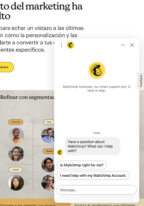
In the case of the Assistant the interface should include some Spanish-language message to manage visitor expectations.
Your visitors would prefer if you offered fully localized experience. But if you don’t, at least give them the heads up before they click on links that take them back to the English-language content and features. Successful localization is about managing expectations.
And, most important, when trying to promote localized software, include screenshots of the localized software.
Rookie mistake and one easily rectified. Mailchimp is making progress, albeit slowly.
Hopefully this will be my last critical Mailchimp post and I will return with one showing dramatic improvements.
PS: For best practices in global navigation, join me at my forthcoming 2-hour class on May 13th!!