A little more than a year ago I wrote about Mailchimp’s improved global gateway.
Here is what you would have seen in the header back then:

And here is the header today:

Much has clearly changed, but I’d like you to focus on the global gateway icon.
The generic globe icon (which I have long recommended and was included back in 2022) has been replaced by a “globe on stand” icon. I honestly can’t imagine why they made this change. The globe ends up a bit smaller, which is not ideal from a usability perspective.
Is the icon intended to be explicitly geographic instead of generically “global”?
If so, clicking on the icon brings up a menu that is anything but geographic:
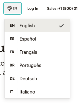
The menu is simply a list of languages (something I could comment on in a later post). What “language” is English or Spanish or French?
But the point here is that sometimes companies just can’t leave well enough alone.
The previous globe icon was better — it was cleaner and, most important, more standard. I can point out dozens of global brands that have embraced the generic globe icon over the past five years making it an informal design standard. I could certainly be wrong but I highly doubt the “globe in stand” icon is going to be a global standard anytime soon.
Here’s hoping Mailchimp reverts back to the previous icon in the months ahead.