A few years ago I wrote about the translation icon and its many variations at that point in time.
I thought now would be a good time to revisit this icon.
Let’s start with the Google Translate. This icon has not changed in substance over the years but it has been streamlined a great deal.
Here is the icon used for its app:
![]()
Microsoft uses a similar icon across its website, apps, and APIs:

I’m not a fan of this icon, despite how prevalent it has become.
Before I go into why exactly, here is another app icon I came across:
![]()
These first three icons display specific language pairs, which could be interpreted as showing preference for a given language pair. This is the issue that I find problematic.
Why can’t a translate icon be language agnostic?
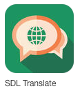
Here is how SDL approaches the translation icon:

Although the icon is busy, I’m partial to what SDL is doing here — as this icon does not display a given script pair.
Here is another icon, from the iTranslate app:

The counter-argument to a globe icon is this: It is used EVERYWHERE. And this is true. Facebook, for example, uses the globe icon for notifications, which I’ve never understood. Nevertheless, the globe icon can successfully deliver different messages depending on context. In the context of a mobile app icon, I think a globe icon works perfectly well.
So the larger question here is whether or not a language pair is required to communicate “translation.”
Google and Microsoft certainly believe that a language pair is required, which is where we stand right now. I’d love to see this change. I think we can do better.
