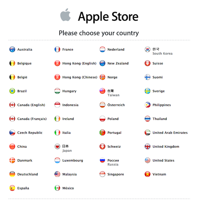
Not exactly breaking news, but Apple Store is now live in Russia.
I love the art they used for the launch:

The global gateway that Apple uses for its online stores is a subset of the gateway it uses for its main website. Both global gateways are in need of improvement. For starters, they need to rid themselves of the flag icons. I’ve yet to find a usability study that demonstrates that flags help users find their local websites more quickly. I believe flags can actually hinder usability.

I’m hard on Apple in this regard because the company is usually pretty good at simplifying things. But when it comes to global navigation, Apple complicates things. And, worse, Apple sends a message out to other companies that flags improve usability. When they often do not.
