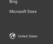
Saw on Daring Fireball that Microsoft is previewing its new global website (link).
Naturally, I wondered “Where the heck did the global gateway go?”
It used to be in the header. But no more.
The global gateway has been demoted to the footer. This is the bad.

But there is a saving grace — Microsoft is now using a globe icon to highlight the gateway. This is the good.
Also good, it’s a nice clean design.
I’ll have more to say once the site goes live, officially.

To coincide with the launch of its new homepage this week, Microsoft has rolled out their new global gateway: http://www.microsoft.com/en-us/home/locale.aspx
What I like:
– Simplicity of visual design aligns nicely with new homepage
– Localization of language and region names in list of available website contexts
– Icon used in global gateway link on new homepage
What I don’t like:
– Website header and footer navigation are included on global gateway in the language of currently selected context, making them useless to people who wish to change their language preference
– Beginning each individual context choice with the language makes finding your region difficult
Neutral:
– Positioning of global gateway link in footer contributes to the simplified header navigation, but, as you point out, makes finding the link to change website contexts more difficult
Ken
Ken, I agree that it’s nice to see the languages presented natively. Microsoft generally does a very nice job of this. As for rationale behind the sorting of the languages — that’s for a separate blog post!