A global gateway doesn’t have to be fancy. In fact, it shouldn’t be fancy.
It should be as easy to understand as a stop sign. Form and function and nothing else.
You don’t want people getting confused, waiting for animation to load, or just missing it altogether. This happens all the time.
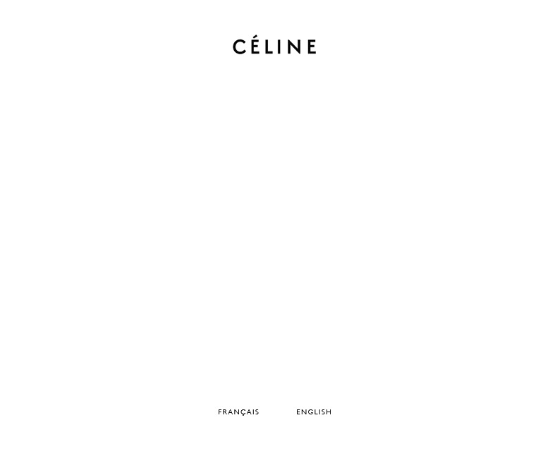
The fashion house Céline sure keeps it simple:

In one page you know exactly what languages the site supports and there is no chance you’ll miss it. I certainly didn’t.
What other global gateways exhibit such minimalism?

Simple? Not really.
Simple for the user would be no such page at all.
“Unfortunately, some sites always return this special page (for the home page) instead of implementing language negotiation. This forces everyone to always go through that page while offering no apparent advantage. Bad human factors design.” [link]http://www.w3.org/International/questions/qa-when-lang-neg[/link]
Language negotiation is very useful and I often recommend it as well, but it too has its flaws. You always need some visual gateway in the event the user is traveling, on a different computer, etc.
Also, to prevent users from hitting this page repeatedly, many sites simply use cookies to capture the language preference.
It’s easy to design a minimalistic gateway if your language support is also minimalistic — namely, just two languages.