First of all, this device looks really cool. The ocean also looks inviting right about now.

But while visiting the Flite website I couldn’t help but notice the US flag in the upper right corner. Perfect placement, by the way, for the global gateway menu.

However, I didn’t realize that North America had a flag. I’m not sure Canadians would agree with this approach.
If I’m based in Canada, do I get the same shipping rate as my southern neighbors? As far as I could tell, no.
So why the US flag for North America?
I’m honestly not sure. I clicked on the gateway menu, shown here:
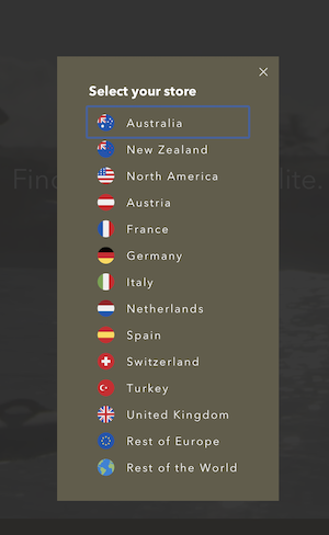
You can get a better sense here for why flags simply do not scale on global gateway menus. In short, when we create regional sites we often find ourselves wanting flags that don’t exist. Like “North America” or “Americas” or my least favorite region “Rest of the World.”
So an easy way to avoid these conundrums is to simply drop the flag model entirely.
It’s a lot easier to do than you might think. Apple did it. Many companies have migrated away from flags over the past five years.
And if you want additional ammunition to push your company away from flags as a UI element, check out my May 26th class: Lead the World to Your Website.