Normally I like to talk about companies that have been steadily improving their global gateways.
Occasionally though I encounter a company that appears to be heading in reverse.
E*TRADE is heading in reverse.
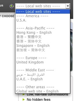
About two years ago, here was the E*TRADE global gateway:

Note the globe icon to the left of the menu — an important visual element for making the gateway discoverable to users regardless of their native language.
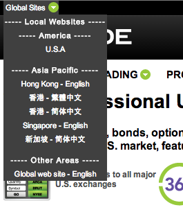
Today, that globe icon is long gone. Instead is a simple “Global Sites” link in the header. While the header location is excellent, the lack of a globe icon makes it less accessible than before.

Click on the Global Sites link and you’ll see this gateway menu:

The menu has remained largely the same over the years, which is too bad.
The menu itself was poorly executed — is “local web sites” really needed?
Is “other areas”? I don’t think so. If the menu simply left off these mini-headers, it would be a lot cleaner and easier for users to quickly scan. Keep in mind that this is real estate devoted to people who may or may not speak English natively, or at all.
Second, “United States” is more standard than “U.S.A” though this is a minor point.
Finally, note that “web site” is spelled both as one word and as two in this menu.
Details matter. And it’s clear from this gateway that a number of details have been overlooked as the E*TRADE website has evolved.
The lesson here for the rest of us: Don’t take you eye off your website. It’s tempting, I know, to just assume that everything has already been proofed and tested by others. But every so often take another stroll through your website and global gateway.
