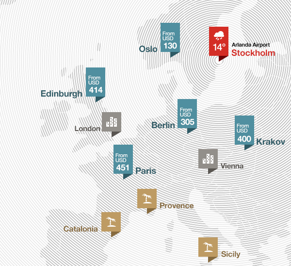
I enjoyed this vision of the future of an airline website (by Fantasy Interactive), particularly this map of fares and destinations:

Why haven’t other airlines embraced this vision yet?
Probably because most haven’t even figured out how to make their booking engines as user friendly as Kayak.com.
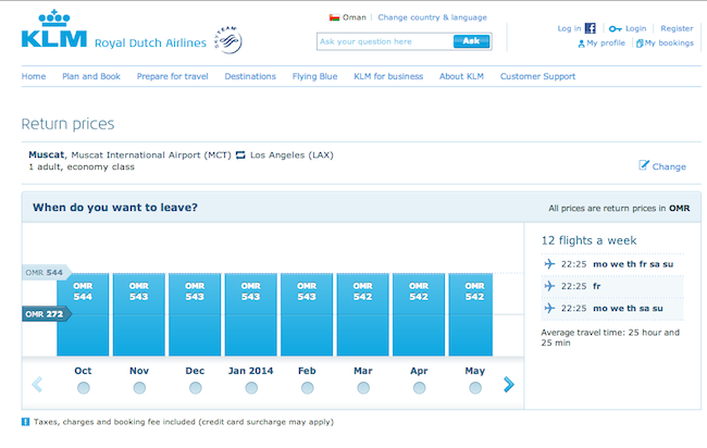
KLM appears to be headed in this direction with its new design (currently in beta in Oman).
Here’s a screen grab of the booking engine:

It’s a clean, functional design that gives you a nice view of fares across a period of time.
Amazing how something so simple remains so elusive across so many airline websites.
KLM came out on top as the best global airline website in the 2013 Web Globalization Report Card.
It leads the airline category with support for 27 languages (Delta, American, Emirates all support fewer than 20 languages).
And yet KLM still trails travel websites such as Hotels.com, Kayak, and Booking.com.
These virtual websites have exerted pressure on airlines and hotels and rental car companies to focus more on user experience.
It’s ironic that airline websites are finally becoming more user friendly just as the airplanes themselves have never been less user friendly (for those of us in coach).
