Every time Apple updates its web design (which it did recently) I get hopeful that the global gateway will receive a similar upgrade.
But this has not yet happened.
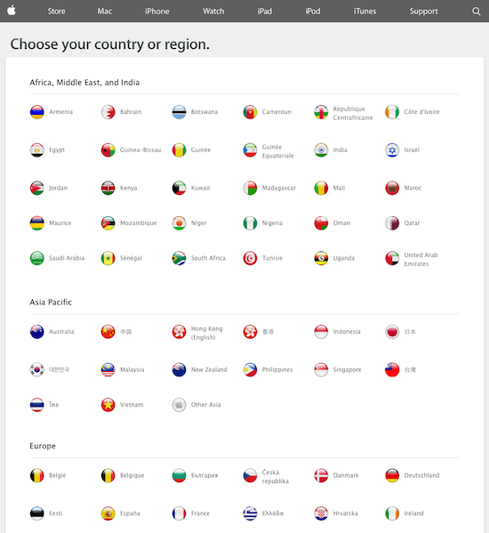
Apple’s global gateway remains firmly entrenched in the use of flags. And that’s unfortunate.

Flags are not the best icons for global navigation. They are fraught with cultural baggage and they do not scale well.
Look at the chaos of colors here — and how much real estate is required to include the countries:
Another problem with using flags as a navigational device is the lack of certain “regional” flags.
For example, Apple supports a Latin American website, denoted by this useless icon:
![]()
Am I as a web user supposed to know this Apple icon is intended to signify Latin America?
Too often, the global gateway has no internal champion — a person or team in charge of ensuring that global navigation does not get overlooked during the process of any redesign. I suspect that this is the issue with Apple.
In a future post I’ll discuss something else that is wrong with this gateway, and also not unique to Apple.
Comments are closed.