I was happy to see that Philips launched a new (and improved) global gateway recently.
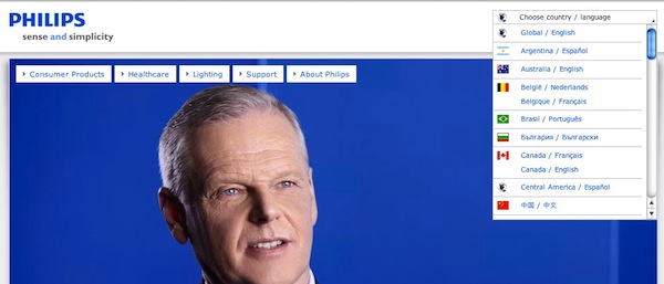
Below is a screen grab of the old gateway, as seen on the home page:

The menu was well positioned in the upper right corner, but it was a LONG menu.
And the use of flags was problematic for many reasons, such as adding a great deal of overhead to every single web page. (Here are a few previous thoughts on flags)
Now, here is the header from new Philips home page with new gateway:

No more pull-down menu — just a simple text link: United States – English.
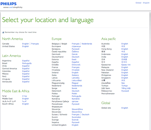
Click on the link and you are taken to a new menu – notice the absence of flags:

Overall, a very nice improvement!
One recommendation: I would still like to see a globe icon positioned next to that global gateway link in the header. The icon communicates “global gateway” to users regardless of their native language.
To illustrate the value of the icon, here is the header from Philips Japan. Imagine you don’t understand Japanese and you want to navigate to a different local site; would you know that the link in the upper right corner is your way out?

Nevertheless, Philips has taken huge strides forward in improving its global gateway. (This will be reflected in the next Report Card.)
PS: Speaking of global gateway, there are still a few copies left of The Art of the Global Gateway (now on sale).
