As you know, I’m an active proponent of the “global gateway.” The global gateway refers to the many visual and technical elements that collectively direct Web users to their country- and/or language-specific Web pages.
Whenever I run across a good, bad or just plain weird global gateway, I make sure to take a screen grab. Here are three gateways worth mentioning:
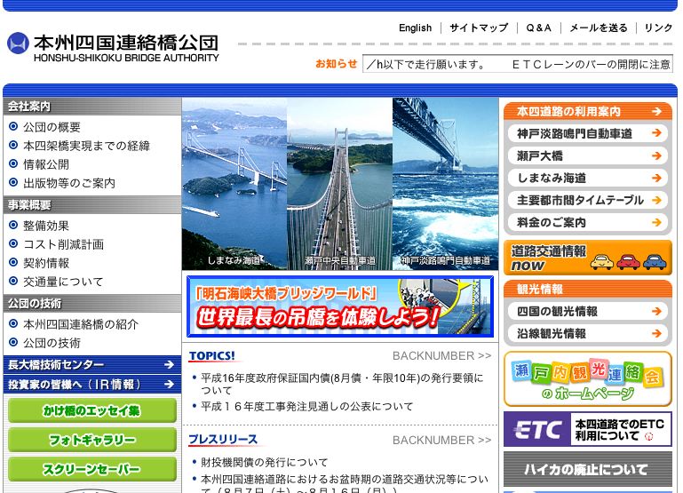
First is the Japanese home page of the Honshu-Shikoku Bridge Authority (don’t ask how I ended up here). This is a great Web page for English speakers who don’t speak a word of Japanese. Why? Because the page features an “English” link in what I refer to as the “sweet spot” of global navigation.

This Web page illustrates just how important a highly visible link — in the user’s native language — is to effective navigation. Had this link been buried at the bottom of the page, I’m not sure I would have found it so quickly, or at all.
Next, we have a not-so-good example of a global gateway. This link, on the Uniden home page, has an informal “Hey you!” feel to it. Worse, the link is provided only in English, which is a slight to French-Canadian speakers.

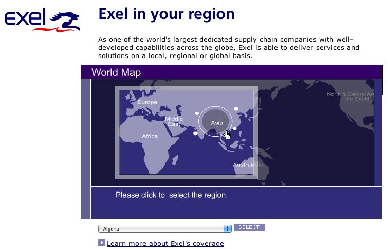
Finally, we have the gateway from the Exel Web site. It is an animated map that changes appearance based on cursor movement. Fun to look at, but a static map would have been more usable. And Exel could have skipped the text altogether. The global gateway needs to be usable to the widest number of people, which necessitates a more visual and less textual solution.

Know of any gateways that you think are good, bad or just plain weird? Please send us an email at info@bytelevel.com.
