Just because the splash global gateway is becoming ubiquitous, doesn’t mean that it has to be boring.
For those who are unfamiliar with the term, the splash global gateway is a landing page that allows visitors to self-select their language or country (or both). Based on the 2008 Web Globalization Report Card, more than 30% of the 225 sites reviewed now use a splash global gateway.
But there is a wide variance in the execution of these gateway pages.
Garrett Colburn of Web Associates pointed me to two companies that are bringing a bit of creativity to the global gateway, with rather uneven results.
First, we have Coleman:
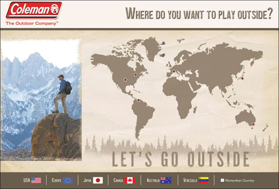
Instead of “Select your country,” the site asks “Where do you want to play outside?”
The trouble with this approach is that Coleman doesn’t yet offer many outdoor places to play. For example, the only Latin American Web site is for Venezuela, not a country that I associate with “play” these days. And where is Brazil and Argentina?
A global gateway page calls attention not only to the countries you support but also those you do not support. In this case, by using a large map, the user sees all the parts of the world that Coleman does not yet support. You probably don’t want to use a map if there are only a small fraction of places on that map that are clickable.
As an alternative, consider the more austere and irreverent approach demonstrated by Ride Snowboards:
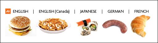
There is no map of the world on this splash page, just a collection of food types to represent parts of the world. One clearly evident flaw is the fact that the languages are not in their native languages. For example, “German” should be “Deutsch.” This is a very common mistake made by English-speaking designers.
Now, what does food have to do with snowboards? You’ve got me, though that’s probably the point of this exercise. A little irreverence might be right in line with the target audience, which does not include me.
I did check out two competitors, and their splash gateways are relatively staid in comparison.
Here is the Burton splash gateway:
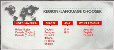
Burton may be staid, but in my opinion, this is most user-friendly gateway of the lot. Notice how the languages are translated. This may seem like a minor detail, but imagine if you visited a splash global gateway and the link to the US Web site was in, say, Arabic script. It wouldn’t be that easy to find. Language is the single most important element of user-friendly navigation.
Finally, here is the K2 gateway:
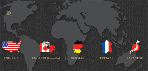
Notice how K2 does not provide translated language names, similar to the Ride gateway. It could be these companies share the same corporate parent (or the same Web designer).
As more and more companies develop splash global gateways, we’re going to see more and more creative approaches, which is very exciting. Just keep in mind that the splash global gateway strategy you settle upon should be usable first, creative second.
To learn more, check out my new book The Art of the Global Gateway.
Burton splash gateway might be the most userfriendly but why do they translate language names and then forget about Canada (French), it should be Canada (Français).