There are many problems with using pull-down menus on a Web site, but the one that jumps out at me occurs in those “Select Country” pull down menus.
Today I tried to register on a popular consumer Web site that will remain nameless.
My default country came up as US Virgin Islands for some strange reason. So I went to the menu thinking that my country of residence would be just a few ticks away.
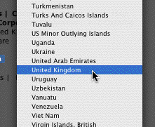
I was wrong, as you see here:
Where’s the United States?

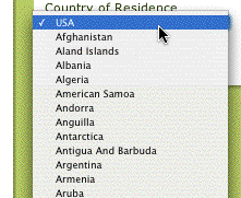
I scrolled around a bit and, sure enough, found my country at the top of the list…
Oh, here it is, right above Afghanistan

I understand why this sort of thing happens. It is assumed that because most people who are registering on this site are American, that they should not be required to scroll down very far to find it. As for the poor souls who live in the UK or Venezuela, well, they just have to be patient.
At a minimum, the US should be repeated on the list, so people like me can find it.
Ultimately, this type of geographic favoritism cannot last. I know of one multinational that did away with it simply because execs in the foreign offices did not appreciate seeing the US placed ahead of their countries. And it implicitly sends the wrong message: It says that you’re an American company selling to foreigners, rather than a global company selling to locals.
So what’s the alternative? I recommend using geolocation, which does a very good job of guessing where the Web user is located automatically. It’s not a perfect solution, as someone may register from one country even though he or she lives in another country. But this type of inconvenience will be the exception and not the rule.
