Apple can’t seem to rid itself of using flags on its global gateway. And, yes, I’ve been writing about this for awhile now.
Every time Apple launches a redesign I get my hopes up.
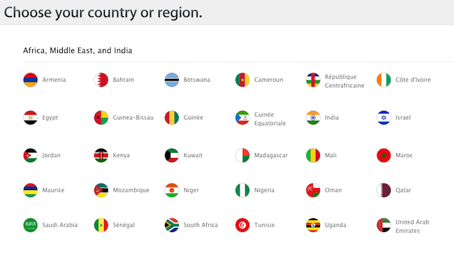
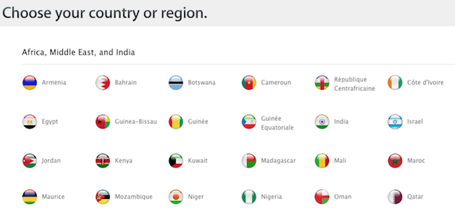
But this latest design merely offered up newly “flattened” map icons, as shown here:
Current Apple Global Gateway:
Previous Apple Global Gateway:
But I’m writing this post not to highlight the flattening of icons but to bring up yet another reason why companies should avoid using flags for global navigation.
First, take another look at the two screen shots, specifically the flag for Israel.
Note the color change, to a darker shade of blue.
I won’t go into why this shade of blue changed because that’s not the issue here.
The issue is this: When you use flags you take on the responsibility of ensuring that you flags match the flags of their respective countries.
And flags have a funny way of changing. New Zealand is currently looking at changing its flag.
When you use flags you incur the added burden of keeping a constant eye on hundreds of designs.
It’s a burden that you don’t need to carry.
Instead, for your global gateway, simply use country or region names in the local language. You can pull a current list from the Common Locale Data Repository — a library consumed and maintained by companies like Google and Microsoft and, yes, even Apple.
I know that some folks at Apple would love to rid themselves of relying on flags. A few operating systems back Apple dropped the Star of David as a keyboard icon for Hebrew in favor of a more generic icon. And, yes, they caught a bit of grief for doing so, which I would is why they need to abandon flags completely, all at once.
Perhaps Apple doesn’t mind the added burden of managing all those flag icons.
But I believe, still, that it’s just a matter of time before Apple drops flags for good.
Latest posts by John Yunker (see all)
- Internet irony - April 15, 2024
- The inherent flaw of the translation icon - April 8, 2024
- Language is a feature (to be promoted) - March 30, 2024
- Speed Kills: Your web globalization investment - March 18, 2024
- For global brands, Russian is no longer a “top 10” language - March 11, 2024